Redesigning Simbi's Book Library for better content discoverability

I worked on optimizing Simbi's Library feature, where teachers and students discover books, for better content discoverability.

Team
2x Product designers
+ 1x PM
+ 1x developer

My Role
Userflows + IA
+ Interaction design
+ Visual design

Impact
46% conversion increase in books chosen for reading or assigning
About the Company
Simbi is an ed-tech web platform used by teachers and K-12 students.
Teachers and students use Simbi's Library to find books.
Teachers look for books at an appropriate reading level to assign to individual students.
They use filters like 'Grade' or 'F&P level' - different ways to organize reading levels - to find books that are challenging yet achievable for students.
1
2
3
4
Problem area
Through user observation, we discovered issues teachers faced as they looked for books for their students.
Teachers gave us user feedback and complaints.
We also made observations on analytics tools including Mixpanel and Fullstory. We noticed that teachers faced issues while looking for appealing books, checking their reading levels, and using filters. Some of these included:
1
Issue: Book covers were cropped, so details were obscured
2
Issue: The hover interaction was time-consuming.
3
Issue: Some filters looked very similar to others, leading to confusion
4
We found issues with filters, book thumbnails and hover interactions.
Some filter options ('Genre' and 'Type') had the same purpose - filtering by Genre - and were confusing to choose between.
Other filter options ('F&P level', 'Gear level' and 'Grade' all did the same thing: find books appropriate for a child’s reading level.
A Hover interaction was needed to reveal details about each book. This was tedious.
Cropped book covers lead to unreadable titles and missing info like Author names.
Long titles were cut off, adding to readability issues.

While trying to choose a filter option, teachers had to look through a vertical list.
Many items were not visible on screen and would require users to scroll. This was an uncomfortable interaction.

Overall Goals
How might we make it easier for teachers to find the right book on Simbi's Library?
Specific Goals
Simplify Library Filters for easier browsing
Identify and implement ways to show book covers without cropping
Increase general comfort of use on the Library
Project strategy
1
User observation
We looked for patterns in user behaviour through analytics tools like Mixpanel and FullStory, and listened for user feedback through our in-app feedback and support channels.
2
Userflows
Through creating a new user flow, we removed the need for teachers to hover on each book to see details by including info right below the covers.
We decided that the filters for 'Genre' and for 'Type' would be combined to form 'Genres and Types'. The 3 separate reading-level filters filters would be combined to form 'Levels and Grades'.

3
Competitor analysis:
Covers and Titles
The internet was full of inspiration for Library UIs.
Media players like Netflix and Prime Video showed cover art in consistent sizes and avoided text titles.
Other ed-tech platforms like Epic also focused on book covers.
This was not possible for Simbi.
We did not have enough in-house artists to create artwork, nor the media files and rights to edit book covers from external publishers.
However, we noticed that music apps like Apple Music and Spotify used blurred backgrounds with colors from the album art. We could use this effect to create standardized, consistent shapes for books.

3
Competitor analysis:
Filters
Media platforms often used multiple columns for Filters. This avoided scrolling, and made the list easier to read.
They also used minimal copy to show if filters were selected - such as 'In 2 places' instead of saying which 2 places were selected.
These were both behaviours Simbi could use to clean up Filters.

4
Wireframes and Prototypes
Based on the priorities and limitations found through research, we began creating wireframes and prototypes for:
A new, consistent background frame for book covers, to fit any aspect ratio of book covers
A simplified Filters bar that combined some of the previously similar filters.


4
Usability testing
We took up usability testing with teachers, instructing them to find and assign books that are suitable and interesting for their classes.
Key Contributions
I implemented several features based on problem and opportunity areas.
Problem Area:
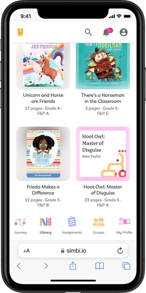
The previous Library showed book thumbnails in a cropped view, often hiding important details on the covers.
This lead to poor readability when titles or author names were cut off, creating a poor user experience.

I designed a template for book thumbnails that showed each book's cover in full detail.
Book covers are now placed in a square thumbnail, with beautiful background colors and effects that showcased the unique cover art of each book.
Each book cover is displayed in its' true aspect ratio, avoiding any issues where titles or author names are cropped out.

I created specifications for developers to create consistent square frames for each book cover.
The frames contained a duplicate of the cover art, blurred and stretched. This meant the backgrounds included the colors and shapes from the original art.

Problem Area:
Details about each book were only visible when hovered or clicked, so users found it difficult to skim.
Details such as the number of pages, and the reading level of the book were hidden behind hover interactions.
This slowed users down as they had to pause on each book cover to view these details.

I included more info about each book below the cover, avoiding hover interactions
This included the number of pages, and reading-level info like 'Grade' and 'F&P level'. This let us remove the hover interaction. It worked great on mobile, where hover interactions are not possible.

The new square thumbnails and visible book info worked great on mobile.
As hover interactions are not possible on mobile, the redesigned Library let teachers see details about each book on mobile.
Problem Area:
Some book filters were too similar and confusing to choose between.
There were 3 filters to choose a reading level appropriate for students, including 'Grade level', 'F&P level' and 'Gear level'.
Teachers also browse books by genre, but the previous UI included a similar filter 'Type'.

I combined some filter options that were too similar to each other, to simplify book filters.
The new 'Genres and Types' filter and 'Grades and Levels' filters combined some of the previous redundant options.

Problem Area:
To choose a filter option, teachers often had to scroll through a long list of choices.
The full list would not fit on screen at once, either. This was an uncomfortable interaction.
I created a layout of columns, for long lists of filter options.
This applied to the new combined filters, 'Genres and Types' and 'Grades and Levels'


Results
We saw a 46% increase in teachers choosing books to read or assign.
More Results
Majority of users satisfied with changes measured in in-app feedback
Successful completion of tasks in user review sessions
Significantly reduced reported user issues