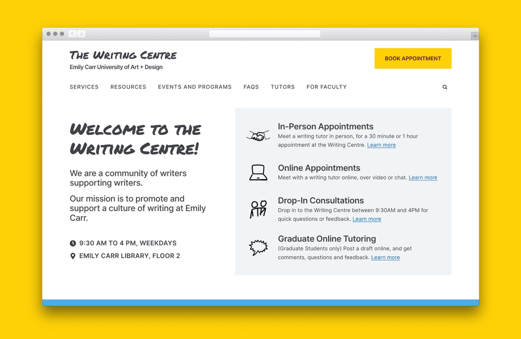
UX design and Wordpress dev for Emily Carr's Writing Centre

My Role
Independent project:
UX and visual design
Wordpress development
Custom PHP elements
CMS training for client
Impact
Launched Sep 2020.
50% conversion rate for booking appointments.
Serving over 4000 visitors every year since launch.
→ Approx. equal to university student population (~3900)
Live at writingcentre.ecuad.ca
About the Organization
The Writing Centre is an academic support service for students at Emily Carr University.
Visitors to their website are looking for help with writing tasks like assignments, tests and creative writing. They might also look for learning resources or writing-related events to attend.
In 2019, students often came into the office trying to understand how the Centre can help them.
The website was not doing its job of informing students about the services offered, and directing them to these services.
This lead to additional work for the Centre's admins to explain and answer basic questions about how the services worked.
Overall Goals
How might we help students discover what the Writing Centre has to offer?
Specific Goals
Discover and resolve usability issues with Writing Centre website
Improve discoverability
and comparison flows for service offerings
Develop flexible CMS for easy updates by clients.
Project Strategy
I designed and developed a new website for the Writing Centre, optimizing for discoverability.
1
Discovery
First, I discovered issues on current site through usability review with participants and interviews with stakeholders.
I looked for opportunities to improve the user's journey and began ideating solutions.
2
Userflows and IA
I created userflows that simplified how students discovered and learned about Writing Centre services.
2
Prototyping
I took on 'Competitor analysis' to discover useful design elements on other websites for services, such as local governments (GOV.UK, NYC.gov) and other Writing Centre sites.
4
Development + Iteration
I developed a Wordpress site, create custom PHP elements to fit the UX.
I then iterated based on usability tests.
5
Launch and Training
I launched the site and supported the client with training on how to use the new CMS structure.
6
Ongoing updates ∞
Over time, I supported the client with feature requests and fixing issues.
My Contributions
The new website helps students find, learn about, and book the services they need.
Problem Area:
Visitors found it difficult to find information they're looking for on the Writing Centre's homepage.
The homepage did not introduce any of the tutor appointments, resources, events or other services offered by the Centre.
A refreshed homepage gives users a starting point to explore the Centre's services.
The homepage now introduces the tutoring services, resources and events offered by the Centre.
These sections link to sub-pages for each of these content types, helping users find more in-depth information.
Problem Area:
The Centre runs in-person and online events.
The descriptions and details of events would sometimes be inconsistent in different places on the website.
The website was not set up to automatically update the information about events, as each page was static and typed out by an admin.
Events now consistent and accessible across the site
Previously static pages, Events are now managed through the CMS and update automatically everywhere on the site.
Problem Area:
Users had difficulty with one of the key usage scenarios for the website, to learn about different types of appointments available.
The Centre offers different kinds of tutoring appointments for students, including online, in-person, asynchronous and more. It's important for users to learn about how these appointments differ. On the previous site, the user had to click into separate pages to learn about each appointment type.
Appointment types can now be browsed with tabs, letting users compare their options
A new tabs-based UI lets the user easily compare and choose the right option for them.
Results
The site now reaches ~4000 people every year, matching the University's yearly population, with 50% conversion
These visitors view pages upwards of 10,000 times a year, with significantly fewer students coming into the office to ask about how the Centre worked and what services were on offer.
Specifics
~50% visitors convert to book an appointment
Visitors click through an average 2+ pages
The site is viewed from 80+ countries each year.


